Do the preparation task first. Then read the text and tips and do the exercises.
Preparation

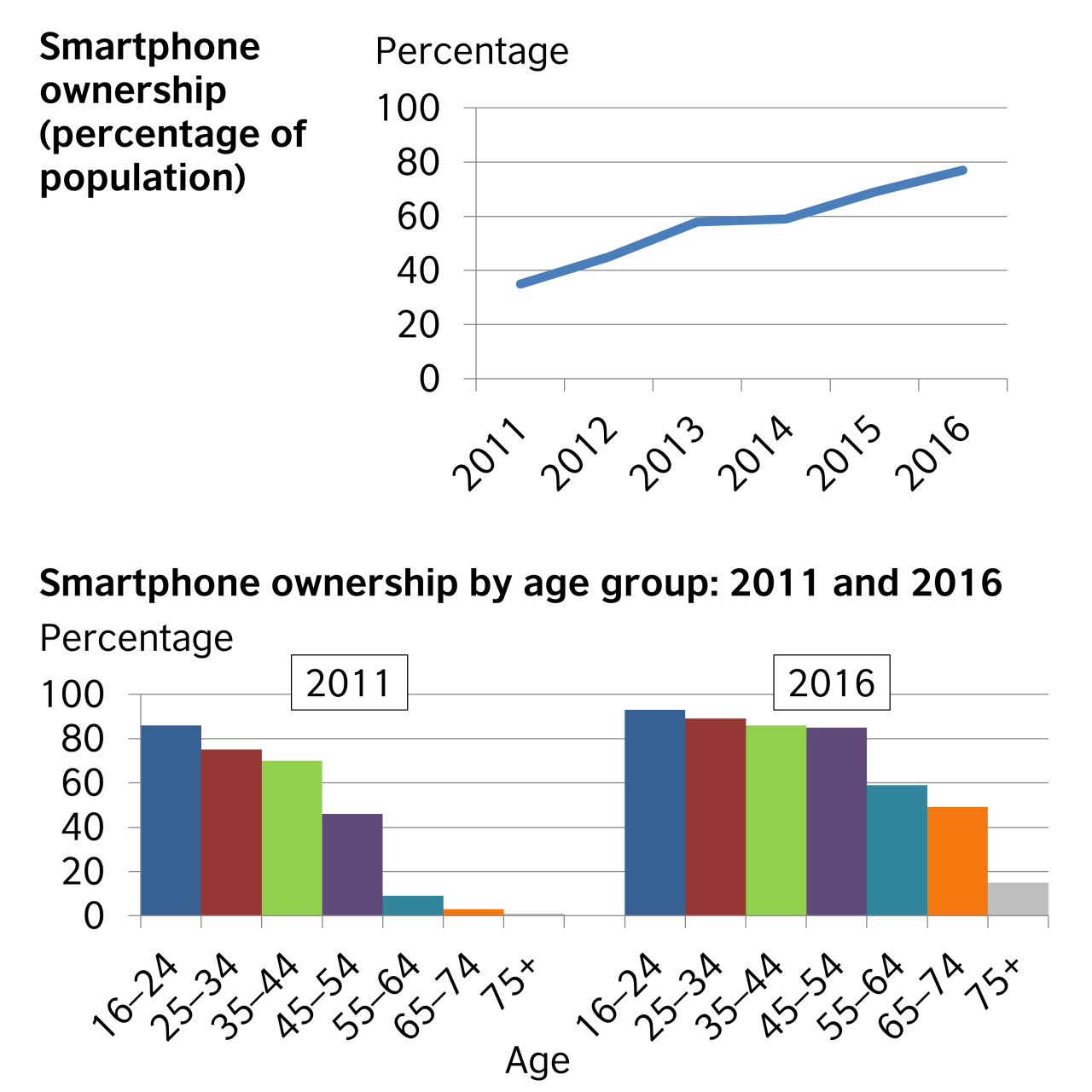
The first chart illustrates the percentage of the population who owned a smartphone from 2011 to 2016, and the second breaks the percentages down by age for 2011 and 2016.
Overall, smartphone ownership increased during the six-year period. In general, the younger people were, the more likely they were to own a smartphone. However, the most significant increases in smartphone ownership between 2011 and 2016 came from people aged 45 to 54, from 46% to 84%; from those in the 55 to 64 category, from 9% to 59%; and from those aged 65 to 74, from 5% to 50%.
The percentage of people who owned a smartphone rose steadily, starting at around 35% in 2011 and reaching about 77% by 2016. People aged 16 to 24 represented the greatest percentage of smartphone ownership in both 2011 and 2016. 75% of people aged 25 to 34 and 72% of those aged 35 to 44 owned a smartphone in 2011, rising to 88% and 86% respectively by 2016.
Although almost nobody in the 75+ age category owned a smartphone in 2011, 15% of this group owned smartphones in 2016.
Please note: This page was designed for writing practice only. Information and statistics in the charts may not be accurate.
Tips
- If you are doing an exam task, read the instructions and make sure you write according to the word and time limits.
- Start by saying what the charts show. In an exam, change the words in the question to write the first sentence of your answer, e.g. These charts show = These charts illustrate.
- The second paragraph should provide an overview of the key features of the information.
- The other paragraphs should describe the patterns or trends in more detail. However, only select the most important ones to write about, and don't write about your own ideas.
- Use linking words and a range of vocabulary to describe what you see in the charts. (You can write % or per cent, but be consistent.)
- Be careful to use the correct tenses to describe the time periods shown.


Yes, I did. In my work I often show charts of workplace accidents and show how they are reducing over the years but not fast enough
I think I never writed about chart,but I use this,because it is very convenient.
Analyzing, understanding, explaining and drawing conclusions from different types of graphs and data in general is actually a main part of my duties and probably the one I like the most. It is very challenging to search for useful information or new insights hidden in complicated patterns about people, behaviors or financial results.
Dear Ramiro, thanks for your opinion. It's very challenging to analyze data information, but now it's easier because of the use of AI.
actually, I have never written about charts at work or for my studies,so I think it is very difficult .I wish I can but I dont understand the charts to describe it ..please do me afavour and teach me how to write about chart .because I want to get an IELETS test .
Hello Zaman_A,
I'd recommend that you work with the text on this page. First of all, read through it a few times. Notice the vocabulary used to talk about numbers and changes in numbers, e.g. 'percentage', 'from 2011 to 2016', 'break down percentages', 'increased during a period', etc. Make sure you understand the vocabulary and write them down somewhere.
Then you could try to write a sentence or two to describe what you see in the chart. Compare what you said to the model text and learn from any mistakes you made. If you want feedback on a specific sentence, feel free to write it in a comment here and ask us for feedback on it. We don't provide feedback on long texts, but we can answer questions about a sentence or phrase.
When I was learning Spanish, I used to copy short texts several times to try to learn the vocabulary and grammar. That doesn't work well for every one, but it does for me and some other people. You could try it and see how it goes for you.
There are also several other pages in the Writing and Reading skills sections -- be sure to check other levels, too -- that involve describing charts. Use the same approach with a few of those pages and I think that should help you improve quite a lot.
Good luck and let us know how you get on!
All the best,
Kirk
LearnEnglish team
Yes, I have in my shcool I had a subject called stadistich or something like that, we analyzed different events that has happened in the life in general.
This is an absolutely example of a misleading chart since the total number of perentage each age range over 100%. Being said that, the inaccurate of the data due to writing pratice purpose is allowed as per the note, chart should be chosen logically.
Hello Thu_tran2911,
I assume you're referring to the two bar charts rather than the line chart. I don't agree that these are misleading. The bars do not show a percentage of the total population but rather what percentage of each age group owns smartphones. In other words, in 2011 over 80% of people aged 16-24 owned smartphones and just under 80% of people aged 25-34. There is no reason to add these together; they describe different groups, not percentages of the whole population.
In a similar way, I could say that 60% of women have brown eyes in a certain country while 70% of men have brown eyes. That does not mean that we are describing 130% as each statistic describes the percentage within a group and not within the country as a whole.
Peter
The LearnEnglish Team