Describing charts

Describing charts

Learn how to write about charts.

Do the preparation task first. Then read the text and tips and do the exercises.

Preparation
Reading text

Describing charts

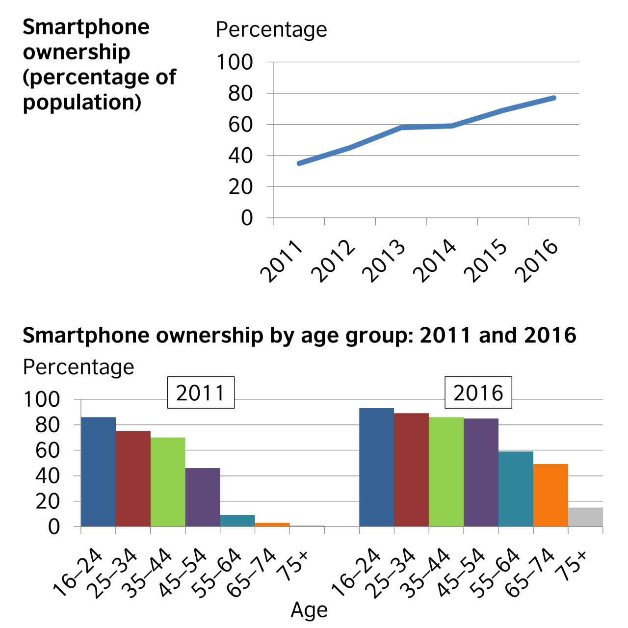
The first chart illustrates the percentage of the population who owned a smartphone from 2011 to 2016, and the second breaks the percentages down by age for 2011 and 2016.

Overall, smartphone ownership increased during the six-year period. In general, the younger people were, the more likely they were to own a smartphone. However, the most significant increases in smartphone ownership between 2011 and 2016 came from people aged 45 to 54, from 46% to 84%; from those in the 55 to 64 category, from 9% to 59%; and from those aged 65 to 74, from 5% to 50%.

The percentage of people who owned a smartphone rose steadily, starting at around 35% in 2011 and reaching about 77% by 2016. People aged 16 to 24 represented the greatest percentage of smartphone ownership in both 2011 and 2016. 75% of people aged 25 to 34 and 72% of those aged 35 to 44 owned a smartphone in 2011, rising to 88% and 86% respectively by 2016.

Although almost nobody in the 75+ age category owned a smartphone in 2011, 15% of this group owned smartphones in 2016. 

Please note: This page was designed for writing practice only. Information and statistics in the charts may not be accurate. 

Tips

  1. If you are doing an exam task, read the instructions and make sure you write according to the word and time limits.
  2. Start by saying what the charts show. In an exam, change the words in the question to write the first sentence of your answer, e.g. These charts show = These charts illustrate.
  3. The second paragraph should provide an overview of the key features of the information.
  4. The other paragraphs should describe the patterns or trends in more detail. However, only select the most important ones to write about, and don't write about your own ideas.
  5. Use linking words and a range of vocabulary to describe what you see in the charts. (You can write % or per cent, but be consistent.) 
  6. Be careful to use the correct tenses to describe the time periods shown.

Task 1

Task 2

Task 3

Discussion

Download
Worksheet197.32 KB

Language level

Average: 4.1 (45 votes)
Do you need to improve your English writing skills?
Join thousands of learners from around the world who are improving their English writing skills with our live online classes and personal tutoring courses.

Submitted by mxoubi0 on Tue, 11/08/2020 - 12:15

Permalink
The chart shows the statistics of smartphone ownership over five years between 2011 and 2016. These relative amounts were distributed into six categories based on the ages starts at the age of 16 to 75+. Overall, the virtual graph illustrates the increase in the percentage of people where started from just below 40% in 2011 till reached a peak of around 79% in 2016 that means the numbers of using smartphones were in increasing continually. On the other hand, the column table demonstrates the mobile phone ownership by age class in 2011 and 2016 so the relative amounts behavior in two years are almost the same as the first age class between 16 to 24 reached up to 80% in both years although the people aged 75+ represented the lowest percentage of the smartphone ownership by 5%, and 15% in 2011 and 2016, respectively. It can be seen that the percentage of using technology in our world in particular for young people has been increasing since it discovered.

Submitted by seito kaito on Tue, 28/07/2020 - 17:22

Permalink
2. I am a university student, so I have not written any charts yet. However, there are various classes at university, and among them, there are classes for giving presentations. In the class of this presentation, various charts such as graphs and tables are used. I recently gave a presentation in class. I talked about global coronavirus infection situation. I used various graphs. For example, graphs showing how many people are infected with coronavirus by region and which countries have many coronavirus infected people. I always find and use graphs on the internet that match the content of my presentation. Also, since I have not been able to go to school because of the coronavirus these days, I am using a table to keep record of my studies. However, I am still not very good at using charts. So, I want to practice chart usage in university.

Submitted by Ayano on Mon, 27/07/2020 - 07:52

Permalink
 I’ve written about charts. I don’t remember in detail, but I’ve done this since when I was elementary school student. In addition, I’m studying to write about charts, and I’ll announce by using some charts at another class. When I was elementary school student, I didn’t write about charts mainly, but I saw charts in textbooks. Particularly, it was social studies classes.   I saw many times pie charts, bar graph, and band graph. For example, it had been explained the percentage of people such like a what age groups is the highest in Tokyo in band graph. In pie charts, it had been shown the industrial production value. By having saw this, I learned what the highest number at the point of heavy industry or light industry and how many Japan is export to the world. I think that we cannot understand only in words and sentences. In fact, it took time to read textbooks and I didn’t go next page smoothly. However, by being charts, I can read meaning of words or sentences in one time. The feature of charts is this. in other words, charts are given us information by looking at in one time. Therefore, I’ll make charts like this and I want classmate to understand my announcement in the class.
Profile picture for user OlaIELTS

Submitted by OlaIELTS on Sun, 26/04/2020 - 17:41

Permalink
Yes. I had, concerning my study.
Profile picture for user JuanManuelLopezGil

Submitted by JuanManuelLopezGil on Tue, 21/04/2020 - 01:00

Permalink
Yeah, when I was working at DDB have to write many reports about my clients; with growth indicators, customer analysis, trends-detection and others that were based in graphics from different types.
Profile picture for user JuanManuelLopezGil

Submitted by JuanManuelLopezGil on Tue, 14/04/2020 - 00:59

Permalink
Off course, my favourite are infographics.
Profile picture for user Nikolaos Stavrianakis

Submitted by Nikolaos Stavr… on Thu, 02/04/2020 - 11:41

Permalink
Well, sometimes I have to create a bar chart or lines graphs using specific applications and then to illustrate them at a company meeting. Nikolaos PS. Could you tell me please, if it's better to use illustrate or present?

Hello Nikolaos

'present' is a good choice here. I wouldn't recommend 'illustrate' in that context.

All the best

Kirk

The LearnEnglish Team

Profile picture for user Magedelabd

Submitted by Magedelabd on Fri, 27/03/2020 - 19:01

Permalink
Yes sometimes I have to create a chart report reflects my company target achievement. Explains how much turnover we achieved for parts and labor. Also I have to compare our current achievement to the previous years and show how the trends go.

Submitted by jazmin marquez on Tue, 24/03/2020 - 20:14

Permalink
Yes, I have had to write about graphics at work and in studies. I think most people have a hard difficulties to reading these kinds of texts. The above, despite the fact that it is very important, because you can see graphics in the news, in the newspapers, and if you do not know how to read these, you can be uninformed about what is happening in the world. In summary, writing and reading graphics are relevant and necessary skills in our context.