Do the preparation task first. Then read the text and tips and do the exercises.
Preparation

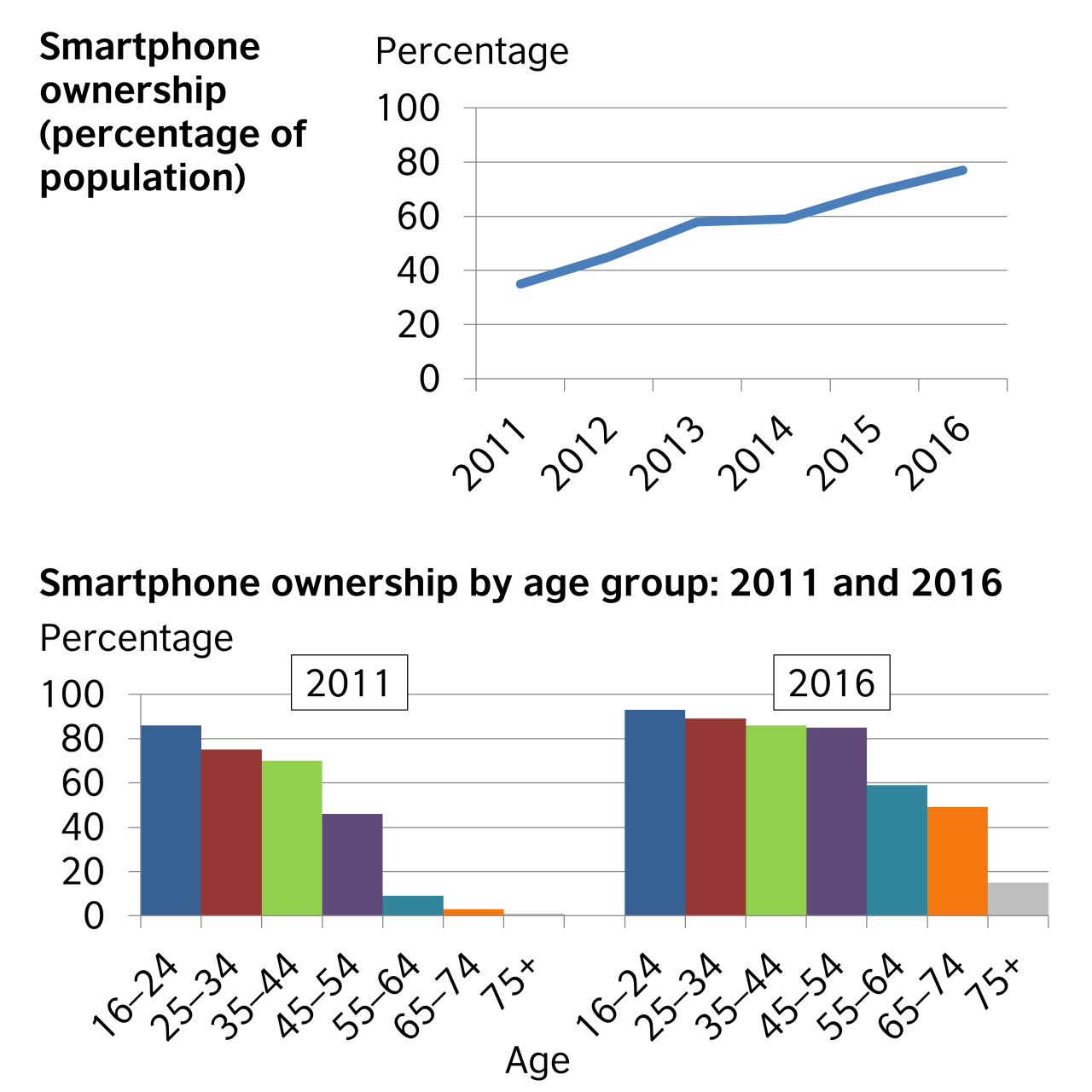
The first chart illustrates the percentage of the population who owned a smartphone from 2011 to 2016, and the second breaks the percentages down by age for 2011 and 2016.
Overall, smartphone ownership increased during the six-year period. In general, the younger people were, the more likely they were to own a smartphone. However, the most significant increases in smartphone ownership between 2011 and 2016 came from people aged 45 to 54, from 46% to 84%; from those in the 55 to 64 category, from 9% to 59%; and from those aged 65 to 74, from 5% to 50%.
The percentage of people who owned a smartphone rose steadily, starting at around 35% in 2011 and reaching about 77% by 2016. People aged 16 to 24 represented the greatest percentage of smartphone ownership in both 2011 and 2016. 75% of people aged 25 to 34 and 72% of those aged 35 to 44 owned a smartphone in 2011, rising to 88% and 86% respectively by 2016.
Although almost nobody in the 75+ age category owned a smartphone in 2011, 15% of this group owned smartphones in 2016.
Please note: This page was designed for writing practice only. Information and statistics in the charts may not be accurate.
Tips
- If you are doing an exam task, read the instructions and make sure you write according to the word and time limits.
- Start by saying what the charts show. In an exam, change the words in the question to write the first sentence of your answer, e.g. These charts show = These charts illustrate.
- The second paragraph should provide an overview of the key features of the information.
- The other paragraphs should describe the patterns or trends in more detail. However, only select the most important ones to write about, and don't write about your own ideas.
- Use linking words and a range of vocabulary to describe what you see in the charts. (You can write % or per cent, but be consistent.)
- Be careful to use the correct tenses to describe the time periods shown.
Discussion
Language level
- Log in or register to post comments
- Log in or register to post comments
- Log in or register to post comments
- Log in or register to post comments
- Log in or register to post comments
- Log in or register to post comments


